Evaluation

Time to say goodbye...

I have thoroughly enjoyed this whole project very much to say the least! Throughout these last couple of months not only have I developed my makeup skills but have learnt a decent insight into so many things in the world which I didn't even think existed! I also feel this whole project is very well thought out as the practical sessions which took place were so relevant to the 'Wild Kingdom' brief, and admittedly I would not of  had a clue where to start or what to use without them! I am so happy with my final looks, and I can't praise the run through's enough! Whilst we're at this point i'd like to say a huge thank you to my models and my friends who let me run wild on their face and hair! Wouldn't of got very far without them!


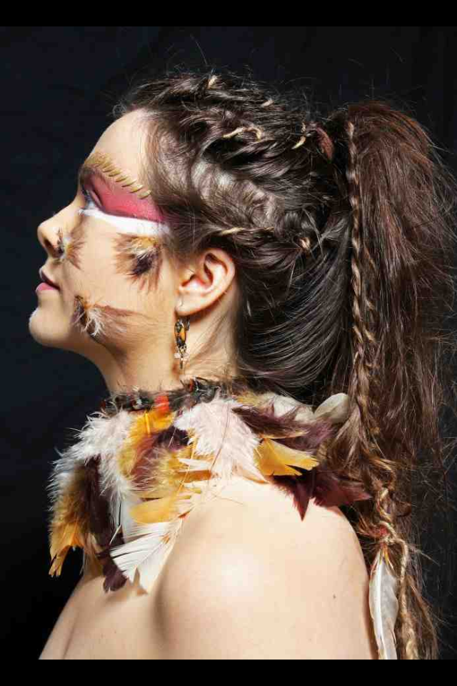
My Editorial went so well, I can honestly say everything went smoothly on the day and I didn't encounter any problems! I did feel very prepared for this shoot and I was ready and eager to do it. I was happy with my styling of accessories, and I couldn't feel more proud of my little necklace creation as I wanted this to be the focus of the styling. I felt really represented the detail in which any editorial shot should include! So from the detailed flicks for the feathered pattern on the face to the string weaved and twisted in the hair, I felt I paid attention to the detail well with this look, giving it a more interesting pull, which ultimately is what the purpose of an editorial shot is!

Simultaneously my catwalk look when doing the final shoot went just as well! Apart from the slight change of idea I feel that I delt with the issue well and adjusted quickly! It is all about thinking quick on your feet, and if someone say's something doesn't look right I guess you need to be quick to think how to change what needs to be changed. So when Sharon told me the half face didn't work I delt with the issue well and carried on, thinking quick how to make this look work. One thing I would definitely work on is my styling for this image, I used the string wrapped around my model to give a 'raw' look, then underneath added a golden leave patterned scarf. The styling did fit the look, and whilst thinking about it if I did a more eye catching style it might of been too much for the whole look. However I definitely do think I need to spend more time when thinking and deciding on the styling. The image as a whole is striking, and I do think it is completely down to the fuller's earth effect. Although the colour palette is limited and if you think about it the whole idea is quite simple, I am still so happy with how each of these factors still give a strong image. When looking at catwalks the makeup and hair was either minimal or extreme... So who wouldn't want to go all out if they have the chance?!

Both images contrast so well and give off completely different perspective's of the tribal look. The difference reflects how varied my research was and also show's any readers how many tribes there actually are over the world and how different they all are! This whole project has opened my mind not only to these new techniques I have learnt but also to this ever so beautiful world.


Catwalk Final Images!


Catwalk final shots with mood board to show how my look reflect it...


Editorial Final Images!


Editorial Final images with mood board to show how the look's originate from it...


CATWALK SHOOT DAY EEEKK!

Time to get this Wild Kingdom to a very near end..

Soon enough my day to shoot my catwalk look arises! I am so happy again with the outcome of this look too! Just shows what all the practice was for and how well it was worth it!! The makeup went well and the look just looked good as a whole! Here are some images of my day!....


EDITORIAL SHOOT DAY AHH!

Editorial done and dusted..

Ahhh so I had my shoot today for my final design for my Editorial look! I felt it went so well!!!! Super super happy with the outcome.. I kept the styling clothes wise to a minimal, and kept it to a black bandeau, as I wanted all the focus to be on my lovely accessory necklace creation ha! I used a beaded set of tribal like earrings to set the look too. Here are a few images of my productive day! Enjoy!...


Ahhhh nearly ready to shoot!

Do's and Don'ts...

Each of my run throughs so far have highlighted any problems which may occur when actually doing the real thing! When doing the run through of my editorial on my friend at home there were many things which I picked up on which could mess up when doing my actual shoot:

  • Getting the cornered patterns on the face symmetrical either side, the eyebrow, top of the ear and bottom of the nose were all good marks to use when figuring out where they should be placed on the face.
  • When using the duo glue, I realised it was stronger than I thought! I only needed a small amount on the end of each feather stuck on the face! However in the run through I put too much on and when it dried I found it drowned out the flick pattern of colours underneath.
  • The rice stuck in a row above the eyebrow, when I painted it gold I used too thick a brush, note to self for next time to use a fine brush like a lip brush!
  • When putting the hair up in a ponytail the hair in the tail was so flat, so maybe considering back combing the hair would be something to consider to make it more volumed?
  • The necklace of feathers that I made looked a little bare at the top, luckily I have found a band of brown feathers with a hint of red which is perfect! I placed this band on top of the necklace when it was already on the neck, and I found it frames it really well! So you will see this genius creation when I do my final shoot...
Highlighted problems for my catwalk look...

  • First of all when applying the fuller's earth to the face there is no point what so ever putting foundation on there, as when I did that in my run through I scraped it all off anyway! So note for shoot; if there are any blemishes use small concealer brush and conceal once fuller's earth is dry! 
  • Making sure the fuller's earth is spread over the face right up to the hair line leaving no gap! This helps link the rice in the hair better with the pattern on the face, doesn't look so separated.
  • Before applying the rice onto the hair, do a smooth layer of the regular fuller's earth mixed with water, so at the end when taking it off the hair you can literally scrape it off.
  • When putting the rice and fuller's earth mixture onto the hair, don't put it on heavily, as long as the texture of the rice is visible on the hair, it doesn't matter how thick it is.
  • Spraying the rice sections gold on the hair works a lot better with tissue underneath it, this prevents the gold spray going anywhere else on the hair.
  • In between the golden rice sections in the hair there was no volume. So when the rice has settled, use a pin tail comb and pull the hair up in between and give it a bit of a back comb if possible!
  • Ensure the ends of the rice sections are pinned at the back tightly and sprayed, the last thing I need in my shoot is for them to loose there position and crumble out of shape!

Sharon says no!


Shazza say's no no no!

So out of the two previous face charts I have designed I feel that the second one included more techniques and was a lot more striking and stronger as a whole as an image. As you can see I decided to use my little rice and Fuller's earth invention on the hair too! I thought it would add to the Fuller's earth effect! But instead this time i used the Screen face gold spray to make the gold more sharp and shiny! Brilliant stuff! So here is my second model Sophie, and actually doing the look on her made me aware of how much space I would have on each section of her face to create the pattern. Anyway so the patterned Fuller's earth went well UNTIL Sharon stated that half faces don't work! So she suggested for me to do it all! So admittedly at the time it was only a run through so I carried on and decided to do a full face chart for my final. So back to the face chart, the eyes looked beautiful; winged out by the dark brown and highlighted by the gold! Sophie's skin is flawless so it made doing the foundation and contouring really easy!


Once the eyes were all done and shaded and the lips were all golden I tested the Fuller's earth pattern in the studio and it didn't show up very well in the pictures, so I chose to use the Aqua colour palette and create a mixture of red and brown. I see the aqua colour to be similar to water coloured paint, its light and simply adds a splash of colour. So using a fine brush I put this colour all over the patter and it came out quite nicely! It gave the pattern a really strong look. I absolutely love the eyes, especially as I went over them with the gold Illamasqua cream which picked up the tear ducts so well giving the design a look of elegance. Here's a little picture of me in action!


Here is my newly sketched face chart.. ready for my photo shoot for my catwalk!


To extend my research into the fuller's earth body idea, I had a look on the internet for a  tribe which help to represent this look and here's what I found...


Here is a body image of how Maasai warrior's from Kenya decorate their body. As you can see it is quite similar to the fuller's earth, instead here they used white chalk paint. This technique is so similar to mine, they have covered the body and carved out the pattern! 


Face Chart's 1 & 2 for Catwalk Shot!


time to walk the cat..

Inspiration from mood board..


Starting my catwalk look now and time is ticking! To get some ideas flowing I did two face charts, trying hard to contrast with my previous looks for my editorial shoot. Referring back to when I did my face shape experiments, I liked blocking out sections of the face and filling it out with colour. Thus my first face chart does just that. In this design I also thought to use the Fuller's earth that I thought was very effective when testing it out on arms. Once the Fuller's earth dried I loved the crackling effect it had, so I decided to include it into this design. Its not so clear in the picture but I actually split the face in half and only used the fullers earth on one half of the face, kind of giving the tribal look a mask. This design was to cover half the face in Fuller's Earth and let it dry without touching it to get that crackly effect. On the other half of the face I drew two sections around the eye that I will block out with bold black and green. The red lips stand out well, and the red, black and green together go well and are definitely tribal colours!


My second face chart I designed soon after is sort of similar in the fact that it's half a face, but a completely different pattern. As you can see I have designed it so the fullers earth is again on one half but this time with a pattern involved. My intention for this look was to get some tribal pattern involved in my designs rather than just having block colours like my previous chart. To create this look I would use one of the mini wooden sticks with the rounded edges that we used in our practical session when creating patterns in Fuller's earth before. Once the pattern is carved out you are left with a lovely crackled Fuller's earth effect. The eyes here are meant to be gold and brown, and surprisingly from my naked palette! The shades of gold and brown really give that royal tribal look, which is what I was trying to create here.


Face chart 3 for Editorial Shot!

Decision time..

Right, the final face chart I designed I am so happy to say went SO well!!!! And is my favourite by far!! I based it on the post I did of face experimentation! And I used the shapes from there which I found! Here's the chart..


 For this particular design I needed some feathers yay! Here's what I found.. and the bag of lots of mini feathers is for the face and the larger more detailed ones for the hair! Got them from Hobby Craft! Where else?! So happy with my buy as they fit my colour theme beautifully! Perfect if you ask me, this must be sign!!! Anyway I did think about the application of the feathers and I though Duo glue!


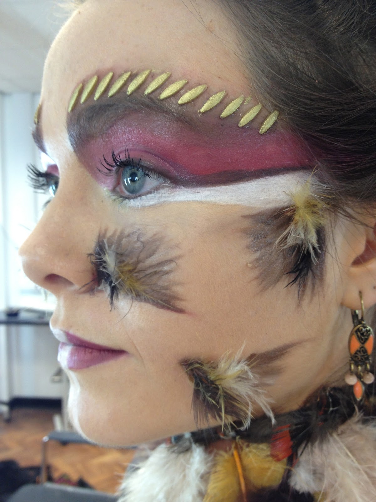
 I first practiced this look whilst I was at home, so I asked a friend of mine who has similar features to my editorial Model Saskia! Her name is Charlie and has great skin to work with! So I first put foundation on the face and concealed any blemishes. I then used my supra colour and a lip brush and mixed the red and brown to create this burgundy colour to get the cornered edges into place on the face. They were pretty easy to place as one was from the eyebrow corner, one from the top of the ear, the other from the bottom corner of the nose and finally one where the bottom of the cheek bone would be. Following the top line of each I made a sort of angle with the supra colour and started to flick out from the middle. The flicks are meant to represent a feathered base layer, so using dark and light brown, the burgundy and white I created different coloured flicks to emphasise the feathers which were going on top. I then painted a thick white line under the eye to stand out and bring focus to the eyes and away from the feathers a little. To add colour to the eyes even more I applied a burgundy/pink to the eye as an eye shadow. I extended the pink and white right out towards the edge of the hair line to create that 'winged' effect. 


I only thought to do one side incase I didn't like the design and wanted to try something else. So here's an image to show the progress of what was happening so far... And i'm liking it! I stuck the feathers on with duo glue onto each cornered pattern on the face, as though they we coming out from the centre of the angle. To carry on the white effect I was trying to achieve I first coloured the lips with the colour on the eyes, making it darker from the edge and lighter towards the middle. I left a gap in the middle of the lips and applied a thick white line which continued until under the chin! Still loving the design I thought to myself where the hell is the gold?! The gold worked so well before so I decided to use another technique from my practical lessons in uni! I use flat rice as a scar-like affect above the eyebrow. I used due glue again to stick them on in a single file row above the eyebrow, then painted them gold! This really finished the look and I was so happy with the result!

Here is a larger image of the end result of this face chart.


Oh and I nearly forgot to include my amazing necklace design!!! I used one of those foamy crown like head bands and used it as a template as a necklace! The image here might help with explaining more what it looked like. I used this plant pot to hold it in place whilst I created it. I layered the feathers from the bottom to the top to create a feathered necklace! It looked so good with the makeup design and really gave the animal related look I was going for! After all throughout my research of Wild Kingdom, tribal communities are so reliant on animals for their fashion and styling, so this created accessory was perfect!

So im not so great with designing hair ideas, and i'll admit that. So i'd much rather just have the head of hair in front of me and just let loose! So I first tried the typical french plaits, inverted and out, fish plaits you name it, but they just seemed to boring! Like hellooo it's been done so many times. So instead I did twists but with a twist.. haha. I added the string I bought when jewellery shopping and twisted that in with the hair! It came out so well and gave off this golden glow! I did about 6 twists over the top and front of the head and put the hair up in a ponytail. The string followed in the ponytail so I used that to add plaits and twists, then stuck the nice feathers at the bottom of the plaits to add the 'Native American' affect. I was very very happy with this look... Hello final!


Face Chart 2 for Editorial Shot!

Another face chart?

So I realistically need to practice this look on my model, especially as she has a slightly different face shape to my classmate I used before. I made 3 face charts the develop my first face chart because I was a tad unsure and wasn't completely satisfied with how the first practice went.. So here are my three face charts so you can see where i'm going, and I tried them all in a practice with my model for the editorial.. So you've seen this face chart before and i'm going to practice this again only this time on my model. This first picture below is the outcome of this face chart on my model!  I liked the look, don't get me wrong, but it just wasn't enough for me! I need more excitement on the face! Well here's a few images of the stages which got me to that look..


I used liquid latex to go over the soap technique I used to block out the eyebrows, it gave the texture a smooth finish. The smooth finish helped so much when colouring over the eyebrows to visually block them out with concealer and foundation! Still not 100% with this look though so here is my next face chart, and edited version of this one..So as you can see this second version looks more like a band of colour across the eyes and face. I also removed the inner shading with the dark brown eye shadow. This gave the look a smoother transition across the face, much better and sleek. It was easy to edit the previous look, I simply removed the inner shading, applied the foundation then added the gold colour to bind the colours across. The rest of the face was the same, but the difference was amazing! I much preferred this look! Here is an image to show you the outcome of the design..     
   
My third and final attempt at experimenting with this look consisted with blocking the whole head with colour, basically expanding the band of colour I designed before.. I have seen a lot of forehead pattern's on tribal makeup whilst researching which is a good sign! It was so easy to use the gold over the forehead, maybe the gold was a bit much but I loved it! unfortunately this work STILL hasn't satisfied my look I am trying to design.. Really not quite there yet but I guess you don't find out until you actually experiment! So this was definitely a worth while experiment! I still have my love for the red and the brown though, so i'm definitely sticking with that colour choice! Here's the image of how this came out in the end anyway.. I also put some of the Illamasqua gold cream on the hair, right at the front on the roots, gave a nice subtle shine of gold.


Here is an image of the brushes I used...